kaity potak
creative director / copywriter
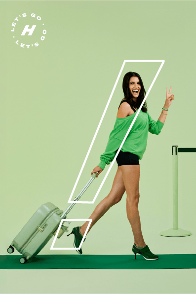
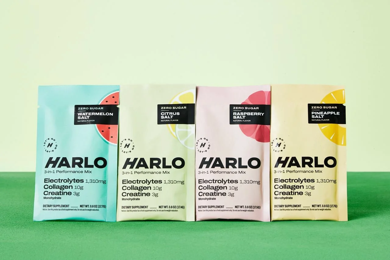
A 3-in-1 electrolyte needed a brand identity…beyond just packaging.
Taking inspiration from Harlo’s bright package design and fruit flavors, we built an inviting, action-filled, supersaturated-with-color look and feel to separate it from the competition, resonate with both men and women, and acknowledge that workouts aren’t the only thing that deplete your body—effectively expanding the product usage occasion from just fitness to fitness, travel, and high-performance parenting.